Home Depot Store Pages Refresh
Customers struggled to find store information
How We Refreshed the User Experience to Boost Engagement and Sales
Client
Home Depot Canada
Services
UX & UI Design
Visual Design
Project management
User Research
Prototyping
Competitive Research
Concept ideation
Industries
Ecommerce
Date
April 2022 to September 2022


Problem
People who visit the Home Depot website often struggle to find the store information they need. Even the most basic details like location, hours, and services are hard to access or understand due to the outdated design. Many of them feel annoyed and disappointed by the website, and end up not visiting the store or choosing a different brand.
What do people look for on the store pages?
The store pages are vital for helping customers locate their closest store and contact them easily. They also show the unique services that each store provides.
Location
Phone Numbers
Store Hours
Services
What was wrong with the page?
We identified several user experience issues with the page that needed to be addressed. The navigation was not intuitive and users had difficulty finding the store hours and home services. The page also had a lot of empty space that made it look dull and unappealing. The readability of the copy was low and the page lacked accessibility features and reviews that could enhance the credibility and trustworthiness of the store.
Difficulty finding store hours and home services
Page has a lot of empty space that makes it look dull and unappealing
Readability of the copy is low
Navigation is not intuitive
Page lacks accessibility features and reviews


As a result...
“I can’t find the Pro Desk hours”
“Where is the Pro flyer?”
“Does this store have a
wheelchair accessible entrance?”
“What's the phone number for
the Tool Rental Department?”
“What's the phone number forthe Tool Rental Department?”
?
How might we redesign the Store Details Page to make the store information more accessible and understandable for the visitors, and increase their satisfaction and loyalty to the brand?
The Solution
Our new store details page has a revamped store hours widget with more features, accessibility icons for easy recognition, redesigned home services elements for better visibility, clearer and simpler copy, and a google reviews element to showcase customer feedback.
Jump to Final Design
My Role
Lead UX Designer / Project Manager
Team Members
May. 2022 - Sep. 2022
Tools
Figma, Miro, Survey Monkey, Photoshop, Illustrator, UserTesting, Confluence,
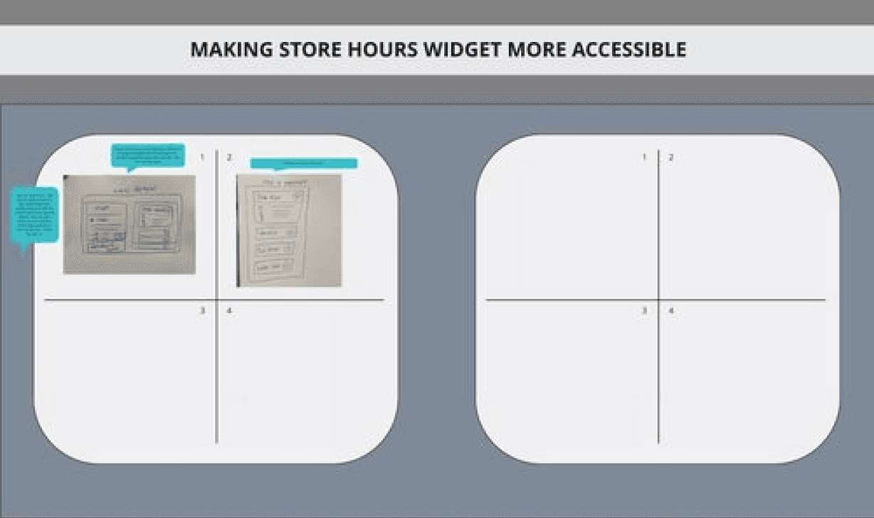
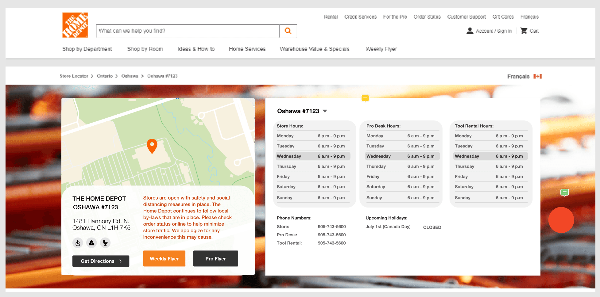
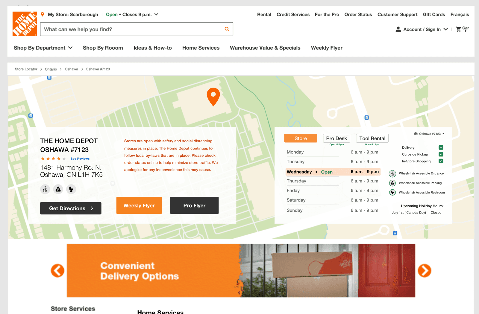
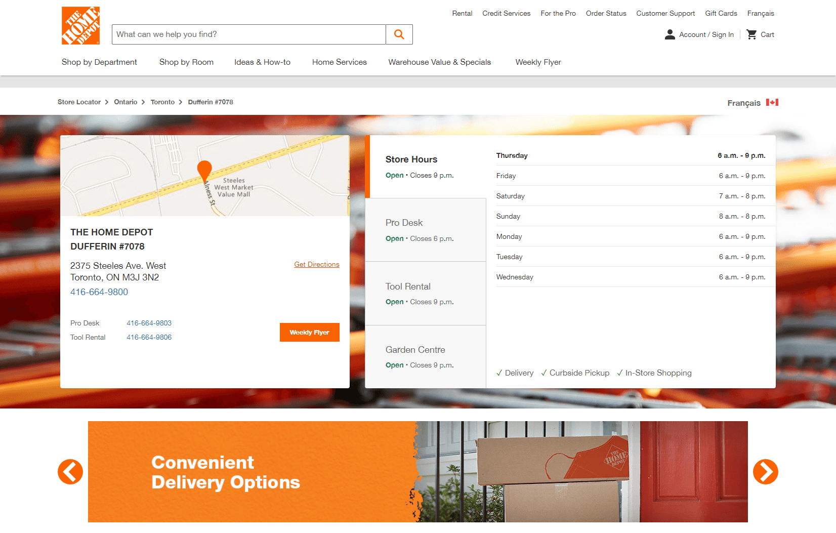
Store Hours Widget
Finding store hours made easy

Before

After
Why?
After conducting user research and testing on the old widget, we discovered that users were confused by the widget’s design and assumed that the hours listed were for all the departments when in reality it was only for the specific department that was selected. This caused a lot of confusion. To address this issue, we focused heavily on redesigning the widget to make it more intuitive and user-friendly.
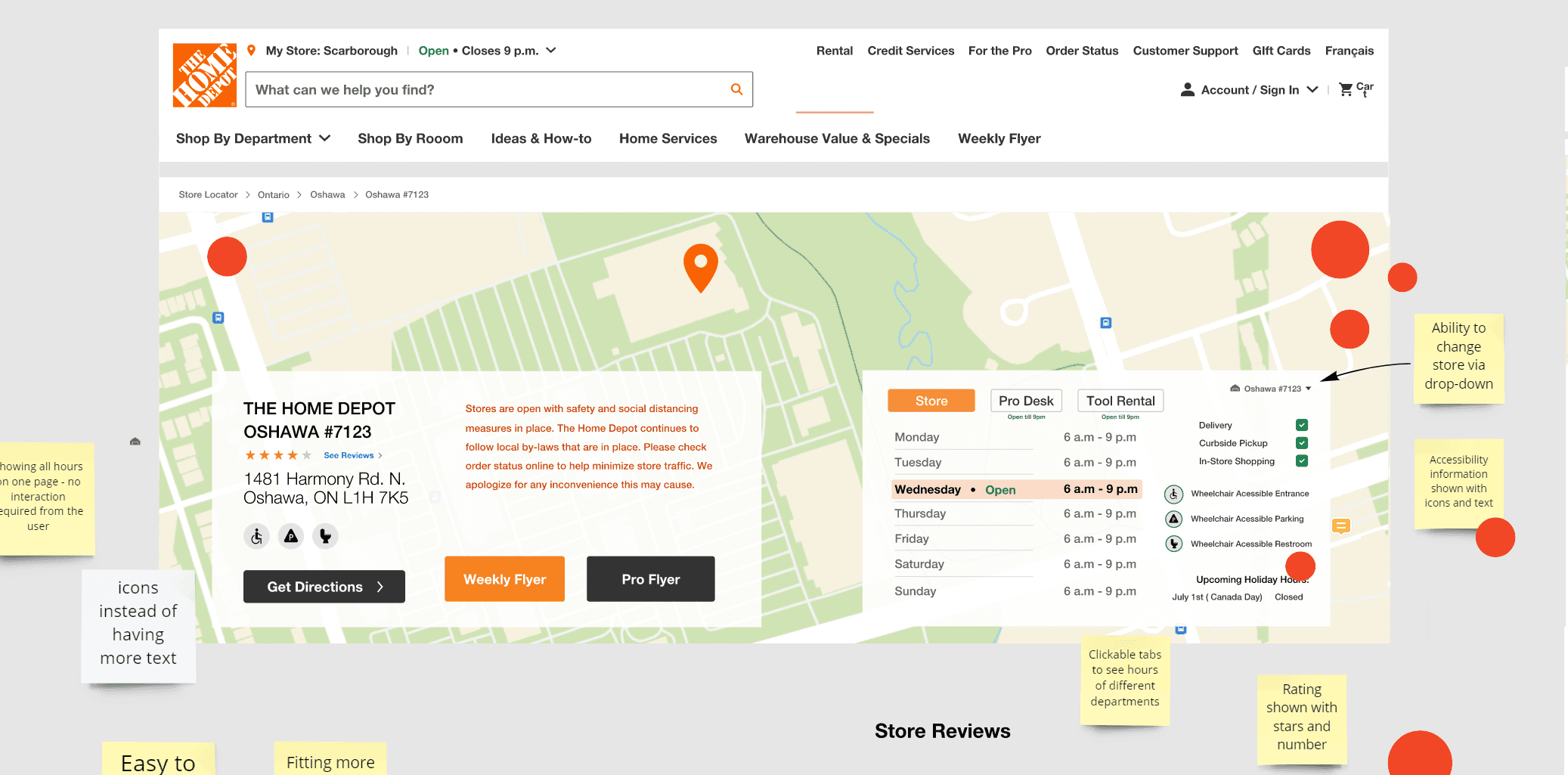
Store Details Widget
Getting all the information you need in one convenient place
After
Before
Why?
After conducting user research and testing on the old widget, we discovered that users were confused by the widget’s design and assumed that the hours listed were for all the departments when in reality it was only for the specific department that was selected. This caused a lot of confusion. To address this issue, we focused heavily on redesigning the widget to make it more intuitive and user-friendly.
Home Services List
Visualizing home services
Why?
We redesigned the home services from a long and cognitively demanding list that users had to scan through to cards with icons and names. User testing proved this made it easier and more user-friendly for users to find the home service they needed.

Before
After

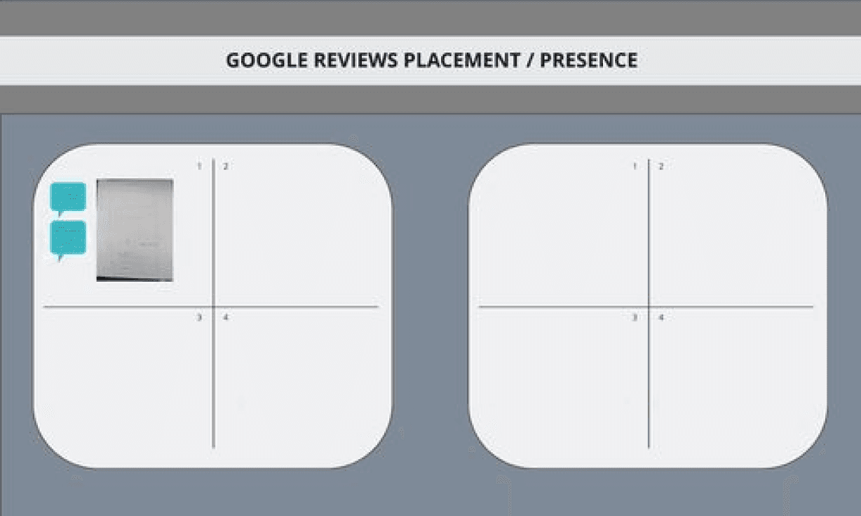
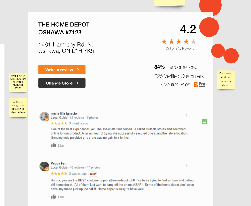
Google Reviews
Increasing trust through reviews
Why?
At the request of the stakeholders, we incorporated a Google Reviews section into the page to improve SEO by increasing relevant keywords. To achieve this, we designed a section that would theoretically scrapes reviews from Google for each store being viewed. Testing proved it was easy and user-friendly to use.

Our Approach
01
Research
Current state analysis
Competitive Analysis
User Research
“How might we” exercise
Problem statement
02
Ideate
Informed Brainstorming
Crazy 4s Exercise
Sketching Exercises
Lo-fi wireframes/sketches
Final sketch review
Stakeholder Feedback
Final Sketch dot voting
03
Design
Hi-fi Interactive prototypes
Mobile and Desktop variants
Feature implementation
Team prototype reviews (3)
Design iterations
04
Test
Usertesting.com tasks planning
User Testing
Affinity mapping
Design iterations
Final design presentation
Developer specifications
Handoff to devs
My contribution
My role as the lead UX Designer and Project Manager on the store details project was to advocate for user research, competitive analysis, ideation and design. I collaborated with my team mate Aleks to conduct research and design activities, and to produce wireframes, high fidelity designs and interactive prototypes for user feedback and testing.
I applied a user-centered design process to redesign the store details page. This involved: analyzing the current state and competitors; defining and aligning on the main problem; and generating and evaluating ideas using sketching, wireframing, prototyping, and feedback sessions. The final solution is live on the site now.
1
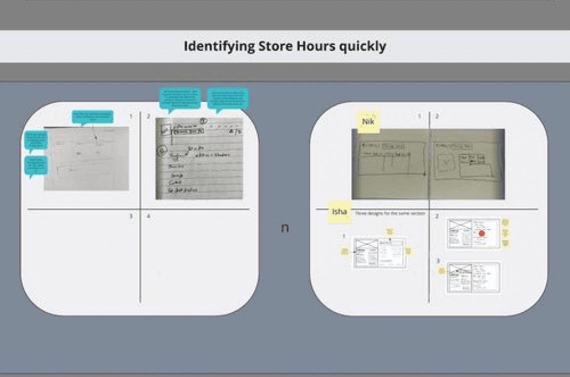
Displaying store hours information clearly
2
Enhancing the accessibility of store hours widget
3
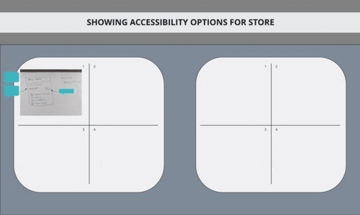
Presenting the accessibility features of the store
4
Improving the visibility of home services links
5
Indicating the options for delivery in-store or curbside
6
Optimizing the placement and presence of Google reviews
7
Simplifying the layout of vehicle rental information
8
Utilizing whitespace effectively
Competitive analysis
Our first step was to analyze the store details pages of our competitors and see if we could learn from their design choices.
We found that:
For the store hours widget:
Most competitors, such as Lowes, Rona and Benjamin Moore, displayed the department hours without requiring any user interaction.
Lowes was the only competitor that had a Pro Desk feature in its widget.
Best Buy had a unique feature that showed the peak hours of the store traffic.
Lowes also had an interactive map that linked to the store location.
Current state analysis
To begin our research, we first had to pinpoint the problems and opportunities for enhancement in the current store details page. I facilitated meetings with the SEO team (our stakeholders) to gain more insights into the issues.
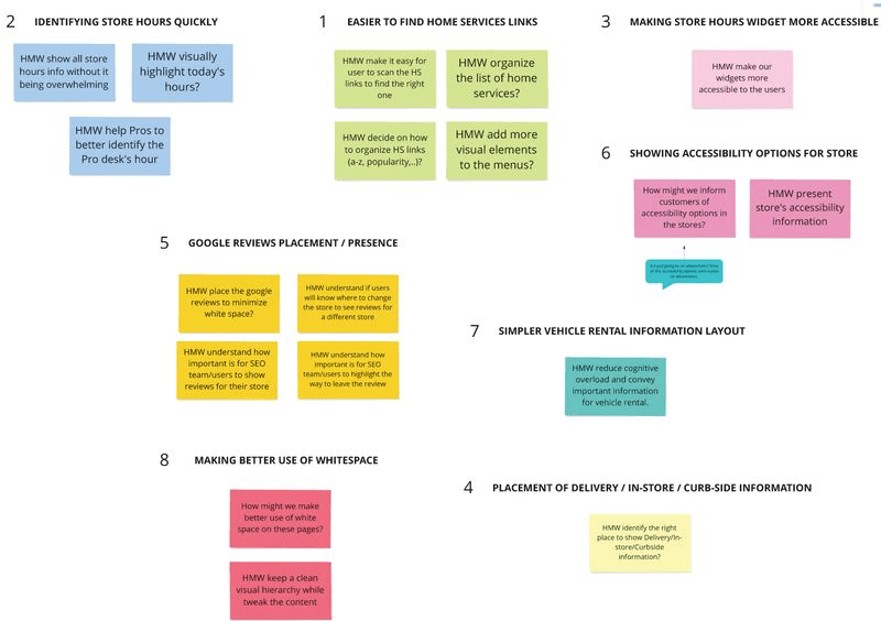
As a result of the discussions and meetings, we identified 7 key aspects of the store details page that the stakeholders prioritized by importance.
01
Research
Our objective was to leverage competitive research in order to devise a solution that caters to the needs of Home Depot customers by providing them with a convenient and straightforward way to access store and department hours, address, and accessibility information.
User Research & How Might We exercise
To better understand how Home Depot customers utilized the existing experience and to identify potential problems, I advocated for conducting user research and How Might We’s first before diving into solutions. I also invited our stakeholders to participate in the HMW and affinity mapping sessions with us, so that as a group, we can brainstorm solutions based on our findings.
We identified 8 key areas and formulated the most relevant HMWs that will guide us. Based on this, we created a main How Might We question that encompasses all the key aspects to help us in the ideation process.
How might we improve the visibility of home services links without cluttering the page?
How might we display store hours information clearly and consistently?
How might we enhance the accessibility of store hours widget for users with different needs and preferences?
How might we indicate the options for delivery in-store or curbside in a way that is easy to understand and choose?
How might we optimize the placement and presence of Google reviews to increase trust and engagement?
How might we present the accessibility features of the store in a way that is informative and inclusive?
How might we simplify the layout of vehicle rental information to reduce cognitive load and confusion?
How might we utilize whitespace effectively to create a balanced and appealing design?
?
How might we improve the Store Details Page to provide a user-friendly, accessible, and visually appealing experience for the visitors?
02
Ideate


Crazy 4s
With our HMW and research findings as our guide, we invited the design team and stakeholders to join us in a creative brainstorming session using the Crazy 4s method with four sets of quick two-minute sketching. Our goal was to generate ideas on how the user experience of the new features and ideas would feel like.
By doing the crazy 4s exercise, we explored different perspectives and approaches to the various features of the page and collaborated as a team to generate ideas and approaches we all agreed with.
We agreed to:
Use an accordion for the store hours widget to simplify the user experience
Display the home services list as cards
Adopt horizontal layouts for better use of whitespace
Include accessibility icons in the store details widget
Place the Google reviews section under the truck rental section
Wireframes/sketches
By doing the crazy 4s exercise, the design team was able to combine various ideas from the crazy 4s and HMWs and produce mockups of them. Based on the final wireframes and sketches, the design team and stakeholders dot voted to select the most feasible solutions and ideas.


We learned that:
Based on feedback from stakeholders, we identified the need to align our designs more closely with the existing design system used by Home Depot
We encountered constraints related to the use of maps from external sources that we needed to address in our design process
We decided to prioritize the development of an accordion layout for the store hours widget as part of our design strategy
Using wireframes and sketches helped us refine our design goals and iterate on different layout options to integrate features into the user interface. For example, we tested several accordion layouts for the store hours widget and used sketches to find visually appealing and user-friendly options for the home services list. This process helped us create an effective and aesthetically pleasing user interface that met the needs of our users and aligned with our design vision.
03
Design
Hi-Fi Prototypes
We incorporated feedback from stakeholders throughout the design process by presenting wireframes and hi-fi prototypes and gathering feedback through design critiques. Based on the feedback, we made changes and iterations to our designs to ensure they aligned with stakeholder needs and expectations. Working closely with the design team, we redesigned the page meeting stakeholder needs while aligning with the company's design standards.
We incorporated feedback from stakeholders throughout the design process by presenting wireframes and hi-fi prototypes and gathering feedback through design critiques. Based on the feedback, we made changes and iterations to our designs to ensure they aligned with stakeholder needs and expectations. Working closely with the design team, we redesigned the page meeting stakeholder needs while aligning with the company's design standards.
We incorporated feedback from stakeholders throughout the design process by presenting wireframes and hi-fi prototypes and gathering feedback through design critiques. Based on the feedback, we made changes and iterations to our designs to ensure they aligned with stakeholder needs and expectations. Working closely with the design team, we redesigned the page meeting stakeholder needs while aligning with the company's design standards.

04
Test
User Testing
We tested the refreshed Store Details page with 12 participants through UserTesting.com, equally distributed between mobile and desktop users. During the testing sessions, we asked participants to complete tasks related to store hours, finding services, holiday hours and suggestions for improvement. The tasks included finding store hours, home service information, and navigating the accordion layout for store hours. Participants were also asked to find upcoming holiday hours for specific departments and to identify which departments were currently closed.
Through user testing, we were able to identify pain points and areas for improvement in our design. The feedback we received helped us improve the user experience and ensure that our final design met the needs and expectations of our users.


Results
We gathered a significant amount of positive feedback on our prototype during the user testing sessions. Participants found the store hours header and accordion functionality to be intuitive and easy to use. They especially liked how the headers stated if the department was open or not and what time it closes. They also appreciated the clear and concise presentation of the home services information. Additionally, participants rated the overall ease of use of the prototype highly, with many describing the interface as straightforward and user-friendly.
However, we also received valuable feedback on suggestions we could possibly make to improve the experience further as noted on the summary slides below:


Design iterations
The feedback we received from our user testing sessions helped us identify areas for improvement and make design decisions to enhance the user experience. Here are the main areas of feedback we received:
Mobile Optimization: Testers noted that there was too much excess information on the mobile version of the prototype, which required a lot of scrolling.
Hierarchy: Testers suggested moving the store services above the banner and placing quick links underneath the phone numbers to improve the hierarchy of the page.
Desktop Optimization: Testers noted that the desktop version of the prototype was crowded and required too much scrolling.
Holiday Header: Testers suggested removing the holiday header and replacing it with a date to avoid confusion.
Quick Links: Testers recommended adding quick links or anchor buttons for different sections of the page on desktop.
Incorporating feedback from user testing allowed us to identify pain points and areas for improvement. By addressing these issues, we were able to create a final design that is more streamlined, easier to navigate, and less confusing for users.
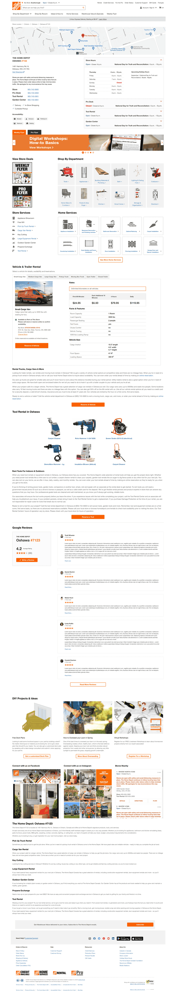
Final Live Design
Our final design is the result of incorporating feedback from user testing and making design decisions to improve the user experience. The design is streamlined, easy to navigate, and presents information in a clear and concise manner.
Before

After
I design intuitive, data-informed digital tools that solve complex problems — with a focus on clarity, usability, and business impact.
I design intuitive, data-informed digital tools that solve complex problems — with a focus on clarity, usability, and business impact.
I design intuitive, data-informed digital tools that solve complex problems — with a focus on clarity, usability, and business impact.
I design intuitive, data-informed digital tools that solve complex problems — with a focus on clarity, usability, and business impact.
Redesigning a High-Traffic Store Page for Usability and Clarity
Users struggled to find key info like hours and services, leading to drop-offs.
Client
Home Depot Canada
Services
UX & UI Design
Visual Design
Project management
User Research
Prototyping
Competitive Research
Concept ideation
Industries
Ecommerce
Date
April 2022 to September 2022

The Problem
Many Home Depot users struggled to find essential store details — like location, hours, and available services — due to scattered layouts and outdated content hierarchy. This often led to confusion, support calls, or even store visits being abandoned. The Store Details page, despite its high traffic, wasn’t meeting user expectations or business needs.
What do people look for on the store pages?
The store pages are vital for helping customers locate their closest store and contact them easily. They also show the unique services that each store provides.
Location
Phone Numbers
Store Hours
Services
What was wrong with the page?
Through usability testing and comparative analysis, we uncovered several design and content gaps that negatively impacted the user experience and store-level engagement:
Essential information was hard to find
Store hours and home services were buried or inconsistently displayed, increasing user frustration and task failure rates.
Poor visual hierarchy
Excessive whitespace and low content density made the page feel sparse and disengaging, reducing perceived credibility
Low readability
Font contrast and copy length created strain for users, especially on mobile.
Unclear navigation
Users struggled to locate high-priority sections quickly due to disorganized layout and labeling.
Missing accessibility and trust-building elements
Lack of assistive features and customer reviews weakened the page’s trustworthiness and inclusivity.
As a result of these usability gaps, Users often asked questions like:
“I can’t find the Pro Desk hours”
“Where is the Pro flyer?”
“Does this store have a
wheelchair accessible entrance?”
“What's the phone number for
the Tool Rental Department?”
These repeated questions revealed critical content findability issues — impacting user confidence, support costs, and overall satisfaction
?
How might we redesign the Store Details page to make essential store information more visible, accessible, and actionable — improving both user satisfaction and operational efficiency?
The Solution
The redesigned Store Details page prioritizes usability, accessibility, and trust. We introduced a restructured store hours module with clearer hierarchy, accessibility icons for faster scanning, and redesigned home services sections to improve task success. Simplified copy, improved visual balance, and a Google Reviews element helped drive user confidence and decision-making — all without adding cognitive load. These changes were grounded in user testing insights and aligned with Home Depot's larger accessibility and CX goals.
We validated the final design through moderated user testing, achieving a 25% improvement in findability of service information compared to the original layout.
My Role
Lead UX Designer / Project Manager
Timeline
May. 2022 - Sep. 2022
Team Members
Manan Monga (Lead), Aleks Kmieciak, +9 cross-functional team members
Tools
Figma, Miro, SurveyMonkey, UserTesting, Confluence, Adobe Suite
Store Hours Widget
Clarifying department-specific hours through improved information architecture
Before
After
Why It Mattered
User testing revealed that customers misunderstood the widget — assuming the visible hours applied to all departments, not just the selected one. This mismatch in mental models led to confusion, inaccurate assumptions, and frustration during store planning.
What We Did
We redesigned the widget to better reflect user expectations and department hierarchy:
Used clearer sectioning for each department
Introduced collapsible menus to declutter the view
Improved labeling and alignment to emphasize specificity
The Impact
The updated widget improved comprehension during testing and reduced user errors when locating department-specific hours. Customers found it easier to scan, and support inquiries related to hours dropped in follow-up feedback.
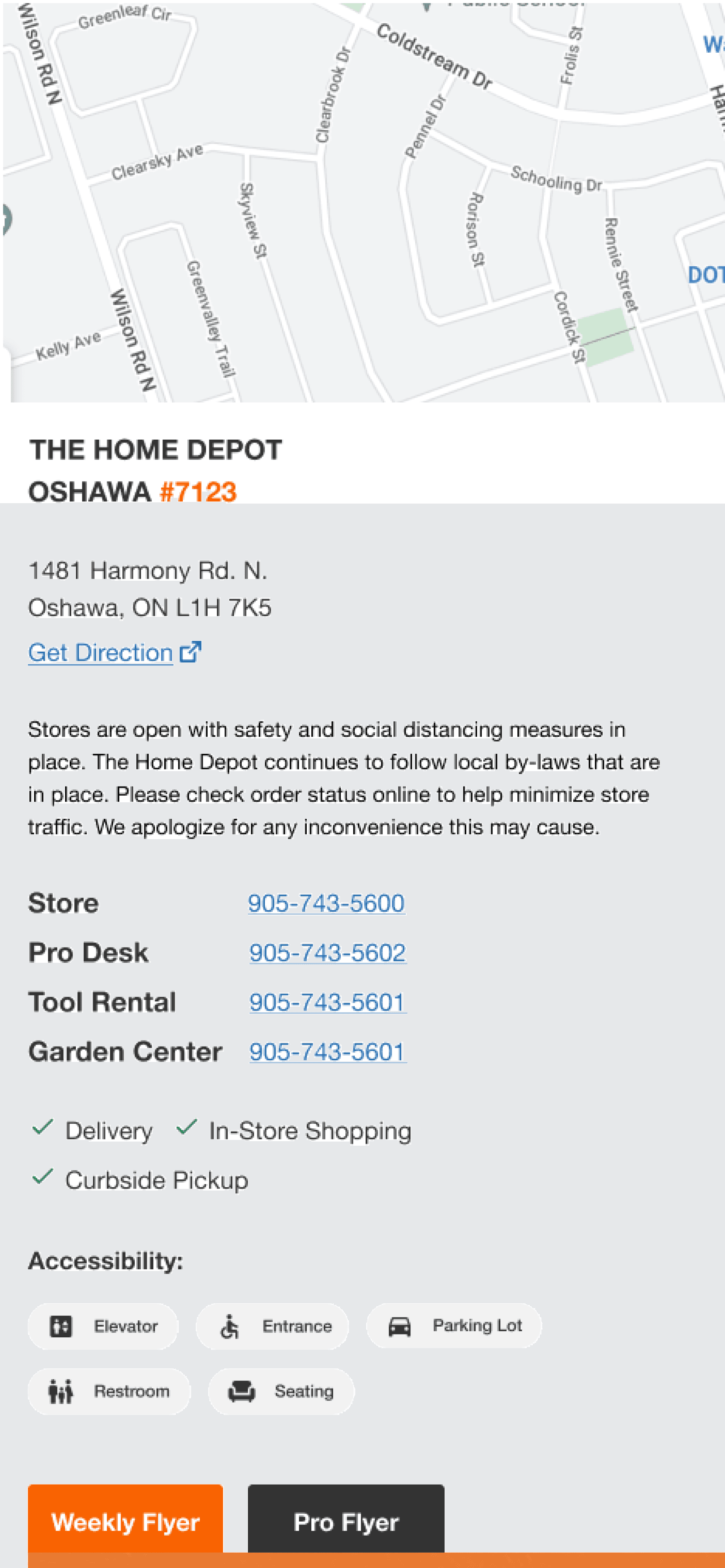
Store Details Widget
Designing for clarity, compliance, and operational readiness
Why It Mattered
The original widget lacked accessibility compliance and failed to present essential store information in a way that was scannable and actionable. Customers couldn’t easily identify services, contact points, or safety protocols — all of which are critical for in-store visits. We also needed to account for evolving legal requirements around accessibility and public health information.
What We Did
Introduced accessibility icons and features to meet WCAG compliance
Added dynamic delivery, curbside pickup, and COVID safety details
Consolidated store services into a clearer layout with direct phone links
Added dedicated buttons for Weekly and Pro flyers — a key merchant priority
The Impact
User testing confirmed that the redesigned widget improved task success and perceived credibility. Merchants appreciated the added visibility for flyers and services, while users found the layout more approachable and trustworthy.
Before
After
Home Services List
Improving service discoverability through visual hierarchy
Before
After
Why It Mattered
The original home services list was dense, text-only, and required high cognitive effort to scan. Users often missed relevant services or felt overwhelmed trying to identify the right one. This created friction at a critical point in the customer journey where users were ready to explore service options but lacked visual cues to guide them.
What We Did
Transformed the vertical list into a card-based grid layout with icons
Grouped services visually to reduce scan time and improve recognition
Added a “See More” action to keep the view clean while surfacing more options progressively
The Impact
Usability testing confirmed the redesign improved service recognition and reduced decision-making friction. Users could now more easily and confidently locate the service they needed, leading to better task completion and perceived ease of use.
Google Reviews
Boosting trust and SEO—within technical constraints
Why It Mattered
Stakeholders requested a review module to enhance store credibility and support SEO by surfacing keyword-rich content tied to each store. Reviews were seen as a valuable trust signal for local users and a boost to organic discoverability. To support this, we explored designing a dynamic Google Reviews component that could pull in relevant content at scale.
What We Did
Designed a store-specific reviews widget styled to match Home Depot’s UI
Explored a scraping-based solution to dynamically surface reviews
Validated the design direction through internal usability testing
Collaborated with developers to assess technical feasibility and integration paths
The Outcome
While the concept tested well with users and was positively received by stakeholders, the technical scope required to implement dynamic review scraping from Google proved infeasible within project timelines. The initiative was shelved, but the design remains documented for future iterations if API access or other integration paths become viable.
Design Process & My Role
01
Research
Current state & gap analysis
Competitor & best practice review
User interviews & insights
Defined problem statement
02
Ideate
Brainstorming workshops (Crazy 4s)
Low-fi sketching & wireframes
Stakeholder alignment
Prioritization via dot-voting
03
Design
Hi-fi responsive prototypes
Iterative design reviews (3 rounds)
Specs for feature implementation
04
Test
UserTesting.com sessions
Affinity mapping + iterations
Final dev handoff & documentation
My contribution
I led the UX design and project management efforts on this initiative, guiding the team through user research, competitive analysis, and cross-functional collaboration.
I partnered with my teammate Aleks to synthesize user insights and design wireframes, interactive prototypes, and final specs. My role focused on aligning the design direction with stakeholder goals, improving usability, and driving faster implementation through clear documentation and structured reviews.
The final solution is now live on homedepot.ca and has since influenced the structure of related template updates.
01
Research
Competitive Analysis
We began by benchmarking competitors’ store detail pages to identify usability patterns and missed opportunities.
Notable findings included:
Lowe’s pre-displays department hours without user input
Best Buy uniquely surfaces store peak traffic hours
Instacart offers strong scannability of services and store options
RONA integrates map-based interaction better than most
These insights helped us identify feature gaps in our current experience and sparked early ideation for potential improvements.
Current state analysis
Through stakeholder workshops and SEO/data team discussions, we audited the existing Store Details page and identified eight usability and content issues — all of which directly affected discoverability, accessibility, and user task completion.
Top priorities that emerged:
Poor clarity around store hours
Limited accessibility (lack of WCAG-compliant structure)
Hard-to-scan service links
Missing or unclear accessibility features
Curbside/pickup options were buried
Google reviews absent or under-leveraged
Layout lacked visual hierarchy for trust
Excess whitespace reduced content density


We began with competitive analysis and stakeholder interviews to identify gaps in store information accessibility. Our goal was to surface user pain points early and generate insights that could guide targeted, scalable UX improvements.
Synthesizing User Needs into Actionable Insights
To translate user pain points into actionable design directions, I facilitated “How Might We” workshops and affinity mapping sessions with stakeholders. This collaborative approach helped cluster user challenges into focused opportunity areas for redesign.
We clustered key user and stakeholder pain points into eight focused challenge areas. From these, we synthesized actionable “How Might We” questions to guide ideation. These framed our problem space in a way that allowed the team to prioritize usability, accessibility, and operational clarity — aligning directly with business and customer needs.
How might we improve visibility of home services without clutter or redundancy?
How might we make store hours easier to find and understand at a glance?
How might we adapt the store hours widget for diverse user needs and preferences?
How might we clarify in-store vs. curbside delivery options for quick decision-making?
How might we integrate Google reviews to build trust and improve engagement?
How might we present accessibility features in a more inclusive, scannable way?
How might we reduce cognitive load in the vehicle rental layout?
How might we use whitespace intentionally to improve visual hierarchy and flow?
?
How might we redesign the Store Details page to make essential store information more visible, accessible, and actionable — improving both user satisfaction and operational efficiency?
02
Ideate
Crazy 4s – Rapid Ideation for Scalable UX
To translate our “How Might We” challenges into actionable ideas, we ran a Crazy 4s workshop with designers and stakeholders. This rapid ideation exercise encouraged creative thinking by pushing participants to sketch four interface concepts in just four minutes.
Our goal was to explore multiple perspectives quickly, highlight usability challenges, and spark alignment around scalable solutions.
What Came Out of It
After reviewing sketches and themes collaboratively, we aligned on a few high-impact directions:
Use accordion patterns in the store hours widget to reduce cognitive overload.
Redesign the home services list as visual cards for better scanability.
Apply horizontal layouts to better balance visual hierarchy and whitespace.
Add accessibility icons for store navigation clarity.
Introduce a Google reviews section (to improve trust/SEO) — placed logically under vehicle rentals.
These directions formed the foundation for our first round of low-fidelity wireframes.
Wireframes/sketches - Translating Ideas into Structure
Following the Crazy 4s session, we translated the top-voted ideas into wireframes to visualize layout directions and functionality. These sketches helped surface feasibility concerns early and allowed us to quickly explore structure and hierarchy.
We conducted stakeholder dot voting to prioritize solutions based on business value, usability, and feasibility.
What We Learned
Design system alignment: We needed to adhere to Home Depot’s existing design system, which required adjusting some visual and layout decisions.
Technical constraints: Embedding third-party maps presented integration issues, which we documented and scoped out.
Accordion prioritization: We chose to move forward with accordion-based layout iterations for the store hours widget due to its clarity and scalability.
Why This Matters
These low-fidelity explorations enabled:
Fast alignment across cross-functional teams
Rapid usability testing of layout variants
Clear next steps for high-fidelity design with stakeholder backing
03
Design
Hi-Fi Prototypes
To ensure our designs were realistic and implementation-ready, we developed high-fidelity prototypes in both desktop and mobile formats using Home Depot’s established design system.
Throughout this phase, we conducted regular design critiques with stakeholders, product managers, and developers. Their feedback helped us prioritize adjustments that supported:
Improved hierarchy and scannability for store details
Clear visual grouping of services, hours, and accessibility info
Mobile-first usability, ensuring seamless interaction across devices
04
Test
User testing - Validating usability and surfacing actionable insights
We conducted moderated usability testing with 12 participants via UserTesting.com, evenly split across mobile and desktop. Each participant was asked to complete tasks reflecting common user goals: accessing store hours, identifying service availability, navigating the accordion layout, and locating holiday information.
Key Goals:
Assess intuitiveness of store hours accordion
Identify pain points in service visibility
Evaluate how users interpreted accessibility and holiday info
User Testing Results
Participants responded positively to the redesigned Store Details experience, with particular praise for the clarity and intuitiveness of the store hours header and accordion. Many found it easy to understand which departments were open, and appreciated the visual grouping of services.
Common phrases from testers:
“Straightforward,” “intuitive,” “clean layout,” and “easy to find what I need.”
Key strengths:
Accordion headers clearly indicated open/closed states and closing times, reducing confusion
Home services layout was faster to scan, aided by visual icons
Overall page flow felt more modern and trustworthy compared to the legacy design
Design iterations
User testing revealed key friction points, particularly around layout clarity and mobile usability. Based on this feedback, we made targeted adjustments to streamline navigation and improve hierarchy.
Mobile Optimization:
Users felt overwhelmed by excess content and scrolling. We prioritized decluttering the layout for smaller screens.
Hierarchy & Structure:
Feedback suggested moving store services higher on the page and placing quick links beneath contact details to improve flow and scannability.Desktop Optimization:
Participants found the desktop version dense and hard to navigate. We adjusted spacing and visual hierarchy for faster information access.Holiday Header Clarity:
The original labeling was vague — testers asked for more specific date formatting to avoid confusion.Quick Links:
Several users requested anchor buttons to easily jump to different sections of the page, especially on desktop.
By integrating these insights, we delivered a design that’s cleaner, more intuitive, and easier to navigate — directly addressing user frustrations and aligning with stakeholder priorities.
Final Live Design
The final design, now live on homedepot.ca, is the culmination of iterative user testing and stakeholder collaboration. It resolves major usability issues by presenting store information in a cleaner, more accessible, and more actionable format.
Key Improvements:
Streamlined Layout: Reduced visual clutter and reorganized key information (like hours and services) for better scannability.
Improved Hierarchy: Store hours, department services, and accessibility info are now clearly grouped and easy to locate.
Accessible & Compliant: Integrated accessibility icons and clearer typography improved navigation for all users.
Mobile-First Considerations: The design adapts well across breakpoints and offers smoother interaction on mobile.
Before
After